259 | Sukhumvit 19 | 10110 | Bangkok | ประเทศไทย

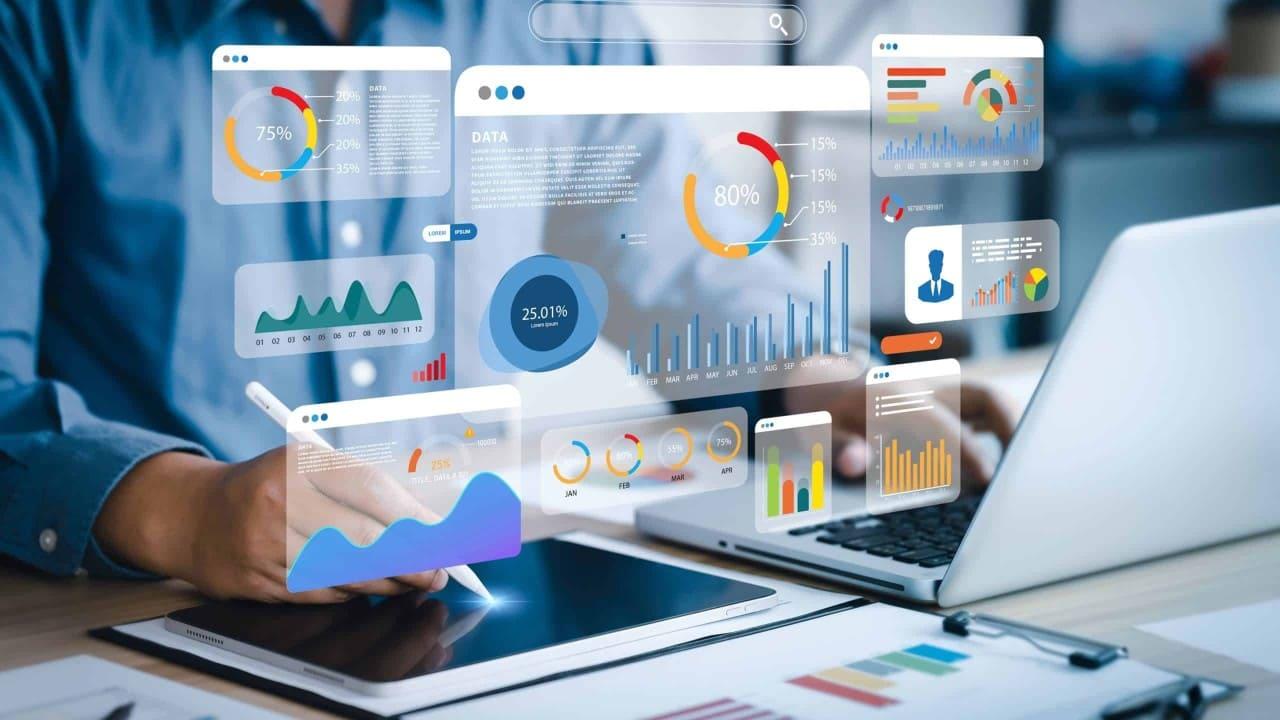
For decades, researchers studied how humans interact with information. Traditional data analysis, often via spreadsheets, posed significant cognitive challenges. Vast numbers overwhelmed experts, obscuring trends. This highlighted the urgent need for intuitive methods to unlock data's true potential, driving innovation in understanding.
Cognitive psychology offered crucial insights into our visual system. Studies showed visual cues – color, shape, spatial arrangement – are processed far more efficiently than text. This spurred early data visualization, moving beyond simple charts to dynamic, interactive representations leveraging our innate visual capabilities.
Early efforts faced tech limits. Static charts lacked interactivity; complex datasets were hard to render. As computing power grew, so did visualization tools. The focus shifted from mere data display to enabling users to explore actively, fostering deeper understanding through direct engagement.
This evolution forged modern visual analytics: a powerful paradigm combining automated analysis with interactive visuals. It empowers users to question, filter, and discover hidden narratives, not just see data. This journey from raw numbers to meaningful visual stories marks a significant leap in decision-making.
The shift from static reports to interactive visual dashboards is profound. Users become active explorers, not passive recipients. This hands-on approach cultivates a deeper understanding of data, moving beyond surface observations to uncover subtle, critical relationships.
A key advantage is rapid hypothesis testing. Users filter, sort, or aggregate data in real-time, instantly seeing the impact of their choices. This iterative process allows faster convergence on meaningful conclusions, boosting productivity and decision confidence.
However, effectiveness hinges on thoughtful design. A poorly designed visualization can confuse or mislead. Tools must present information clearly, using appropriate visual metaphors and intuitive interactivity. Clarity and precision are paramount for true insight.
Visual analytics also fosters collaborative understanding. Teams explore datasets collectively, discussing interpretations directly within the visual interface. This shared context enhances communication and aligns perspectives, leading to more robust, consensus-driven decisions.
The challenge for developers, like DevFlowStudio, is balancing powerful analytics with user-friendly interfaces. The goal: empower users to ask complex questions and receive immediate, understandable visual answers. This requires deep understanding of data science and human cognition.
Nicharee Wattanamongkol
Beyond numbers, lies the narrative. Visual analytics is the brushstroke of that story.
Stay informed with DevFlowStudio's latest insights in data visualization, embedded analytics, and user engagement strategies. Subscribe to our newsletter for expert articles, case studies, and industry trends delivered to your inbox.


Comments (6)
This article perfectly articulates the power of visual analytics. I've seen firsthand how interactive dashboards can demystify complex data for our team. Great read!
Thank you! It's wonderful to hear about the practical impact of these tools. We at DevFlowStudio are dedicated to making such powerful insights accessible to everyone.
While I agree with the benefits, I wonder about the learning curve for truly advanced visualizations. Is there a point where complexity outweighs the intuitive advantage?
That's a valid point. The key is finding the right balance. Our approach focuses on progressive disclosure and customizable interfaces, so users can delve deeper at their own pace without initial overwhelm.
Absolutely inspiring! The emphasis on collaboration and rapid hypothesis testing truly highlights the modern approach to data. This is exactly what organizations need today.
We're thrilled you found it inspiring! Collaborative tools are indeed at the heart of effective data strategy. Thank you for your positive feedback!